Introduction
During the development of Metamorphos and my time on Spicy Dice, I've created and iterated
upon different concepts for menus and any in-game UI elements.
Games are full of information that needs to be conveyed to the player in an organized and
visually appealing style. The most important part of a UI is that it gives the player
everything they need to know to play the game, when they need it.
I wanted to share my experience creating a UI concept and design from the beginning of
development until the end, as well as reflecting on what I've done well on and what I could
have done better.
Early Wireframing
Before we started working on the game, we had assembled a team of artists, programmers, and
designers who wanted to create a game following a specific concept that our creative director
had, it being "a game with interactions between sand and glass that plays similarly to Dark
Souls". This concept was broad enough that it could be expanded to incorporate other mechanics
into the game. At one point, the main character of Metamorphos could have been a human with
the power to control ghostly arms made out of sand!
Eventually, our creative director decided that the player would be made out of sand that would
turn into glass when burned. During this time period, I had come up with multiple different UI
ideas for the game, leaving room for any changes that would surely come at this concepting
phase.
Scoping Down
Honestly speaking, our team of busy university students was not going to be able to make a
game the size and scale of a AAA game given the amount of time we had to work on it. We knew
this going in and decided to scope down, which meant that we would lessen the amount of
content we plan to add into the game in favor of saving more development time to polish our
work to make it look and feel better.
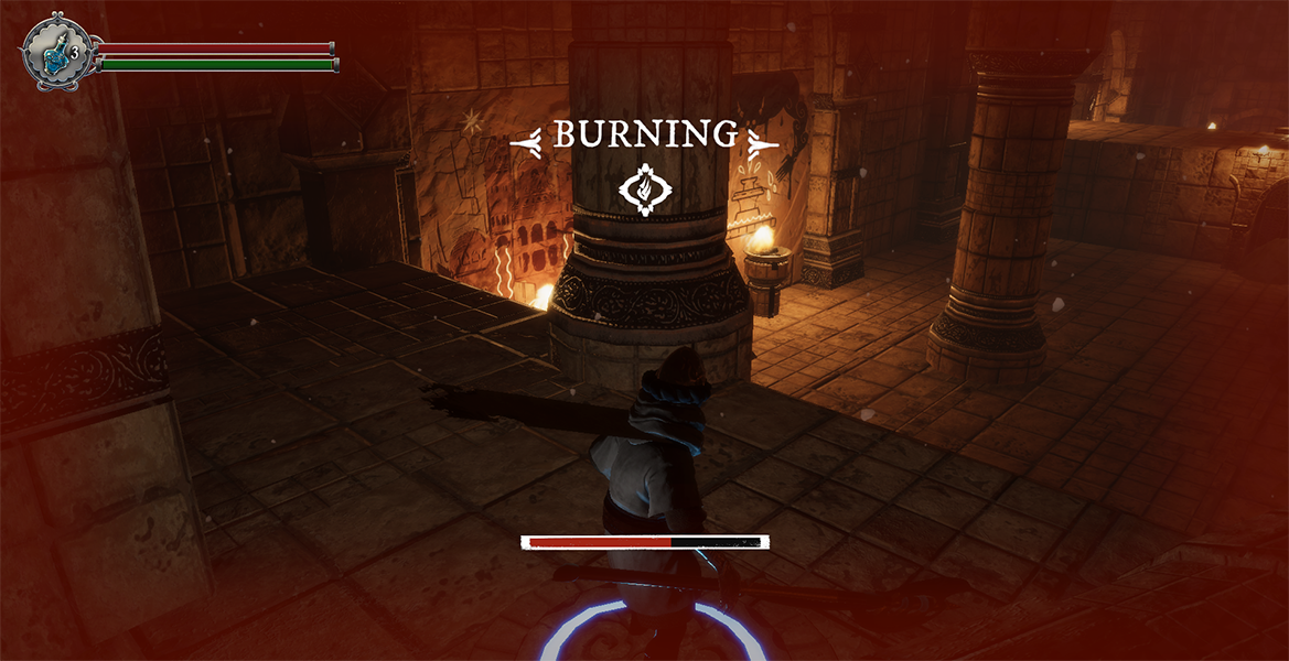
What this meant for me was that I was left with a design with little HUD elements. Without an
inventory or leveling system, the player just has their basic health, stamina, and potions to
display. Although this may sound like it made my tasks easier, it actually was quite
challenging because it was hard to come up with a "style" based on such little information.
A good chunk of the game's lifetime was spent using a very basic looking HUD that I had
designed while I tried to think of how I could make the UI have "style".
What is a "style"?
If you compare games like Tom Clancy’s Division 2 or From Software’s Sekiro, you might notice
that they have a “style” that matches the game. I am unsure if there is such a word that
describes it, but I use the word style because I believe it is comparable to an animation or
cartoon’s art style and follows the rules of one. A game’s style should be consistent, and it
should match the mood of the game. This does not necessarily mean that the UI needs to be
themed towards the game. There are many games that have chosen to go for a “clean” UI while
incorporating elements of their game’s world such as Destiny and Destiny 2 from Bungie.
However, the UI of Destiny just feels like it fits well into their game. I wanted to create
the same feeling of unity that I notice in these UIs into my own game.
Arthur, our creative director, had trusted me to come up with the UI’s style and would assign
an artist to polish up whatever I came up with. This was usually a task that a UI Artist would
be assigned but we didn't have a dedicated UI artist and I was very passionate and wanted to
work on the UI where I could. This turned out to be quite a tall task for me because I was
only a hobby artist so I felt like I had to work very hard to think of something that could be
on par with the artists on our team. The only condition that Arthur had for me was that he
would like it to visually match the game world and look something like Dark Souls. Eventually,
I was able to come up with some concepts that fit what Arthur had in mind for the game when he
sent me an image that I could base ideas off.
Iterating Upon an Existing User Interface
With the concepts for the main HUD decided, the designs were sent to Brian Wong, who was
assigned by Arthur to create a more polished looking version of it. After receiving the
assets, I was thrilled! They looked stunning. However, after playing through the game, I
noticed that some changes needed to be made to improve the player’s experience.
The concept I had designed had an empty space, but nothing to put into it. I figured that if I
put the player’s Oasis Water (potions) into the empty slot, it would be able to save room on the
HUD and provide a purpose for the design. This looked really jarring for some reason and it took
me a while to figure out why.
The size of the Status Bars was way too big because I had to be able to fit the potions into
the empty space and still make the potion design and the potion count (the number) readable.
The colors for the health and stamina were also very hard to read since they were dark,
unsaturated red, and unsaturated green. Looking back now, I probably should have changed the
color of the green so that it would be easier for a colorblind player to play the game,
however, I did not think about it at the time.
Eventually, I was able to figure out what was wrong with the status bar: It was too busy. The
small design in the center of the emblem looked nice on its own but made the area filled with
too much “visual cutter” with a potion also being there. I requested that Brian remove the
small tick mark pattern on the inside and the result was a much cleaner and easier to read
status bar. I also brightened the health and stamina bar colors and gave it a static base
color so that it would be more eye-catching to the player.
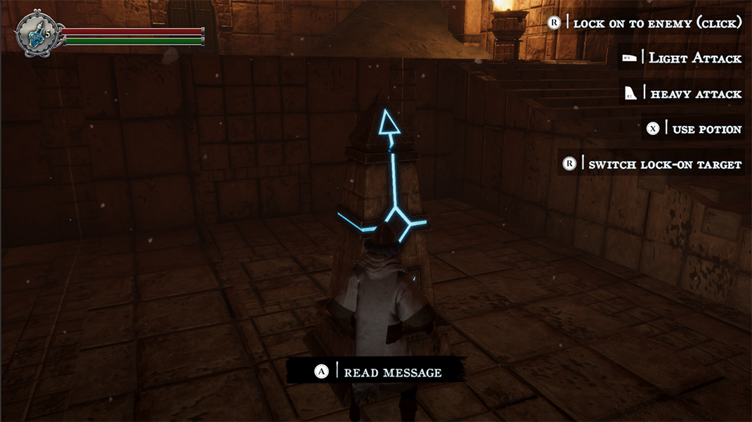
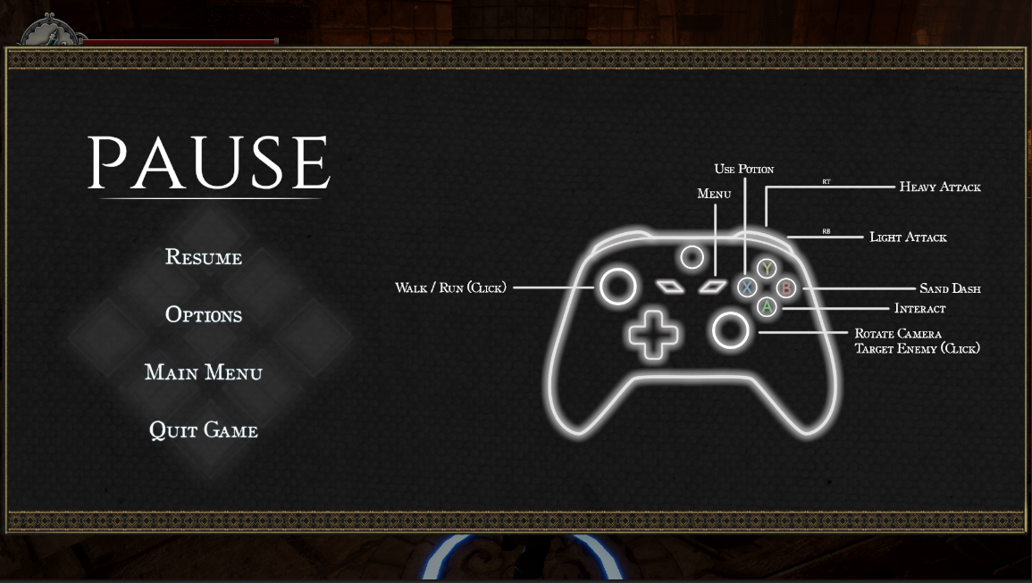
First Implementation of HUD Assets
Current HUD in Metamorphos
Improving the Player Experience
In the past, the player would rest at a fountain to restore their health and stamina, respawn
enemies, create a save point, and refill their potions. The only options that the player had
were to either rest or to cancel resting at the fountain. This design was very redundant because
a player will not ever cancel resting at a fountain if they willingly choose to rest at it in
the first place. I decided to remove interacting with the menu altogether and instead simply
replace it with a message saying, “Potions Restored”. Although resting does more than just
restore the potions, it is usually inferred that a rest point would restore the player’s current
resources as well, so I thought it was okay to leave that bit of information up to the player to
figure out. In the worst-case scenario, the player now has a full bar of stamina and health.
I also added some text that appear whenever the player enters a new location. I thought this
both looked visually appealing to the game’s style as well as provided the player a way to
reference a particular location. Instead of saying “I died at that place with all the stalls!”
they could now say “I died at the stairs in the Old Marketplace!”. This may seem small but
giving the player a reference point is giving them important information on where the player has
already been and a reference to how long different sections of the game is.
Working Under Crunch
On our last week of game development, we worked ourselves to the bone trying to get everything
in before submission. Unfortunately, there is just never enough time to get everything
implemented or polished enough to be kept in a final version. This applied to myself and many of
my teammates.
After experiencing this, I can say that one of the worst feelings in the world is knowing some
of your work is going to be cut for the final game. I still believe I am experiencing some grief
over this as I’m writing this.
Jami Lukins, the design lead at Bungie and my professor and role-model, had given me one of the
most important pieces of advice I had ever received which was “design with the idea that your
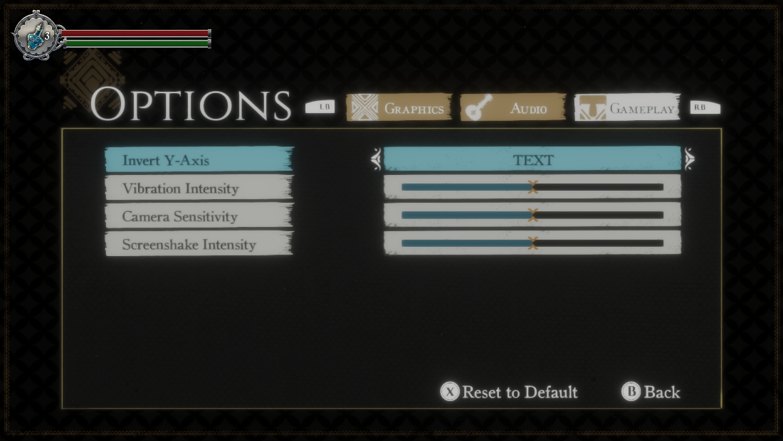
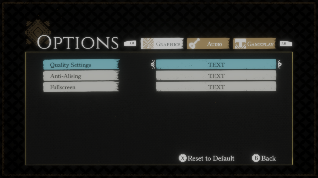
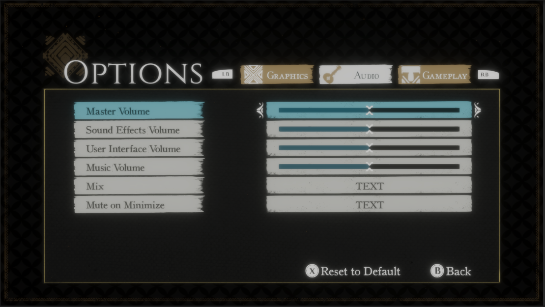
design will need to be changed in the future”. I was able to test this idea when I was given the
news that the new and improved Options Menu that I had been working on for several days had to
be cut due to time constraints. However, I was happy to know that this would not affect the game
or the team because I had designed ahead. A couple of months ago, I had created a simple options
menu that could be used in-place of the new menu incase anything were to happen. With the small
amount of time, I had left (barely two hours), I was able to polish up the old options screen to
be at least more presentable than before. Trying to implement the new options screen would have
taken several hours at the very least, so being able to quickly turn an old and clearly
temporary menu into something that could be shipped was something I was proud of doing for my
teammates.
Closing Thoughts
I really enjoyed working on this team because I could literally feel myself grow as a designer
as I continued this project. I learned so much from my peers and I could feel myself gaining
confidence as a UI designer though their unwavering trust in my decisions. I owe so much to my
team and to my professors for giving me this opportunity to grow.
If I could, I think I would work on this project for another year because I can still see there
are many areas to improve upon for the game’s UI. I have already mentioned it previously, but I
would have liked to be able to test the game some more and design for players who are colorblind
or need some more visual assistance. Going forward I want to be able to create beautiful menus
and UI for everyone to be able to use with ease.
I don’t want to use the COVID pandemic as an excuse, but it was almost impossible to find people
who were willing to playtest the game and provide valuable feedback over the internet with our
current setup. I want to account for things like this in the future and improve my methods of
collecting information to improve my UI. In other words, I want to rely more on player’s
feedback than my team’s feedback and my own opinions.
Although I will hopefully work on more projects in the future, this game holds a special place
in my heart because I was able to become much more confident in myself and it is thanks to
everyone’s hard work that we were able to produce, in my opinion, a pretty good game for some
students! Thank you for reading.